
At first glance, there’s not so much to a book cover. Slap the title over a nice picture. Add the author’s name and away you go. But then there’s that old cliche – don’t judge a book by its cover…
The problem is, people do judge books by their covers. All the time. So a book’s cover is incredibly important. And then when you start to think about it, you realise a book’s cover – that one single image – has to work pretty hard. It has to attract a reader’s attention when lined up among a hundred other book titles. It has to say in an instant what the genre of the book is (but without looking like every other book in that genre). It has to somehow convey the tone and emotion that the book delivers. It has to be memorable, bright, attractive (yet in the thriller genre, also dark). Oh and don’t forget the practical stuff: It has to have room for the title, and the author name. It has to look good both up close and in a tiny thumbnail view. It has to look professional.
This post gives an overview of the many different cover ideas and versions that I and two designers went through in finalising the book cover for The Things you find in Rockpools. Before you see the covers, it helps to know a little about the book, because different genres need different covers.
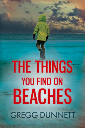
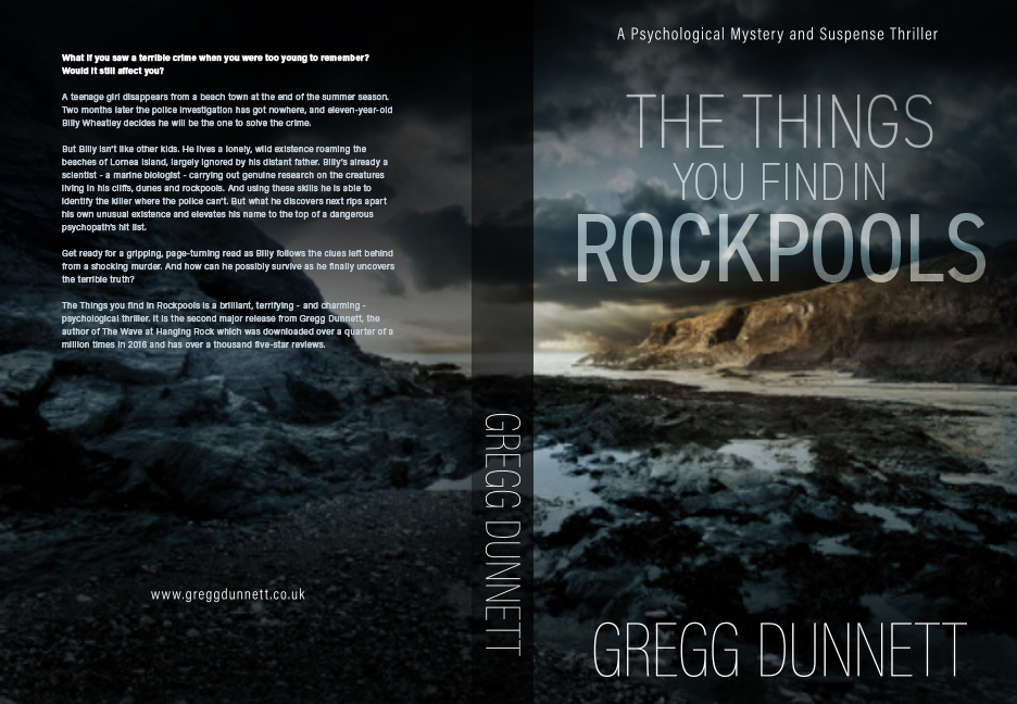
The Things you find in Rockpools is a psychological thriller about an unusual eleven-year-old boy who lives with his father on a windswept cliff overlooking the ocean. He spends his days roaming the nearby beaches, working on his projects and scientific experiments. When a teenage girl goes missing one summer, he decides his next project will be to solve the mystery of what happened to her. But what he uncovers threatens to tear his precarious existence apart.
It’s set on a fictional island, out-of-season, when it’s cold and empty, and the boy has a fear of drowning, which hints at a drama in his past. All themes that I thought might be useful for the cover.
The Process
I first used a professional cover designer who I won’t name for reasons that will become clear.
My first step was to gather together a selection of images that I felt somehow embodied the ‘spirit’ of the book, to send to the designer. I think it’s called a mood-board, although that does sound a bit pretentious. I did have lots, but I deleted most of them, so I’ve only got these left:
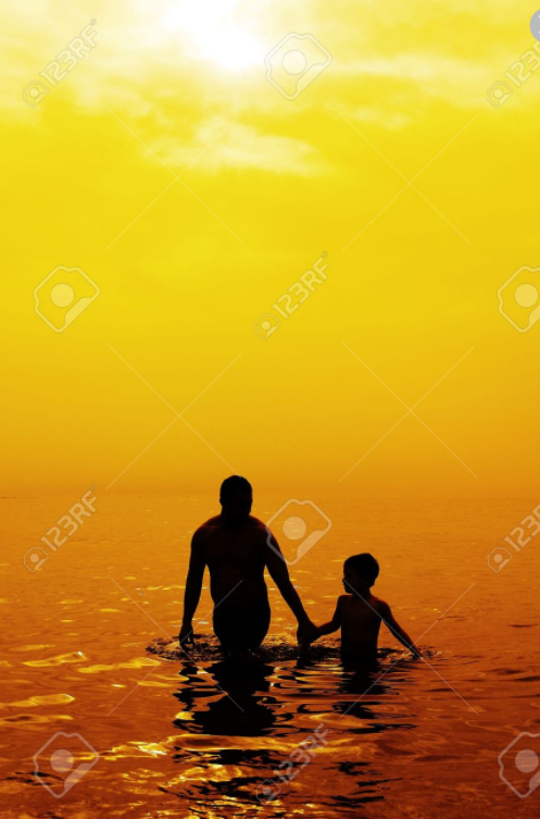
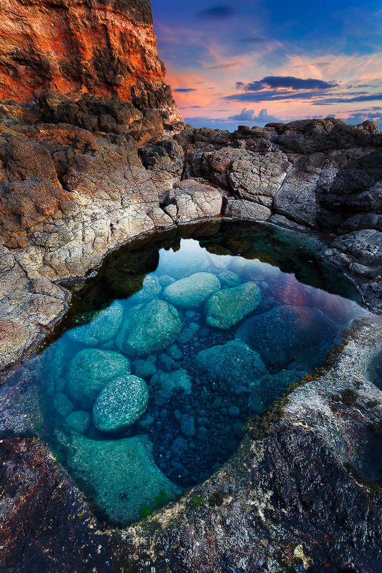
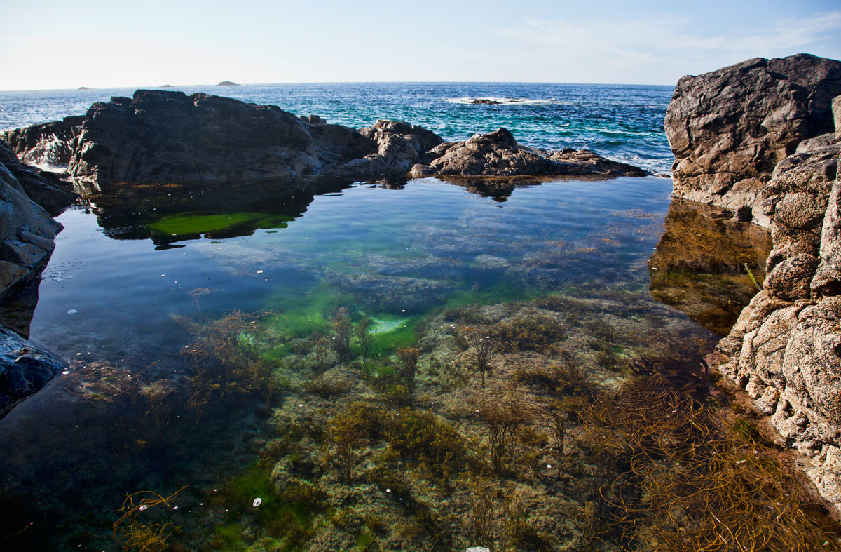
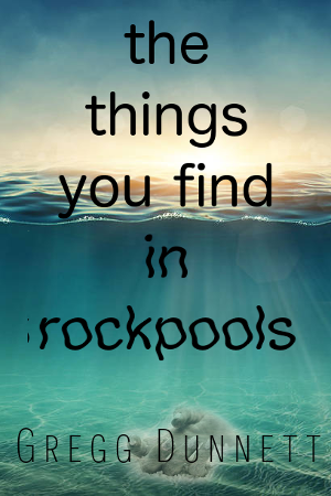
As said the unspoilt, wild island-location is an important part of the book, so I decided early on that I wanted the cover to showcase the beauty of pure clear water, in its colours, or the way light shines through it, or in the way it forms a perfect reflective surface when still. (You can probably tell from the books, I like the sea). I also like those images of half in-half out of the water shots, and I thought this could be a good idea for the cover. I put together a very basic example of this which went to the designer as well. It’s pretty amateurish, but it shows my early thinking. The image next to it is what the designer then came back with.
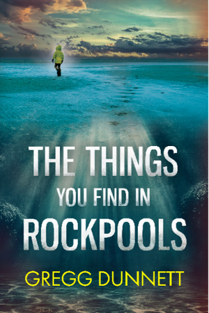
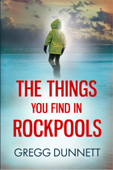
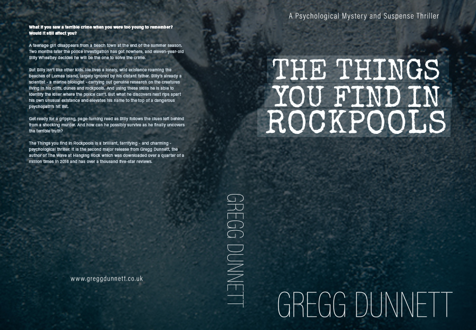
I quite liked that first real cover, and looking back on it I still think it’s OK, but I never really felt it. It just didn’t feel it accurately represented the book I was writing. On top of that I had a number of more easily-articulated issues with it. It was a bit busy. It was hard to make out that is was sunlight dappling through the water. So what followed was a long series of back and forth to try and refine this image into something cleaner and a bit more personal. Some of these are shown below (but by no means all of them, I think we went up to nearly 20 versions!)
The culmination of all this back and forth was that the designer got fed up with me. I can’t blame him!
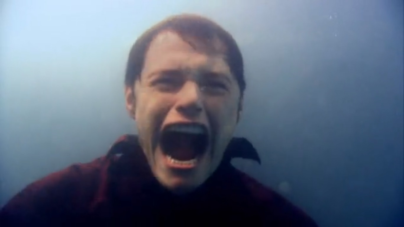
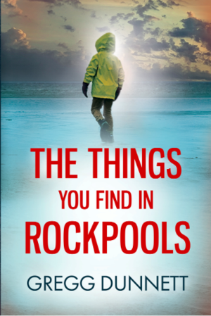
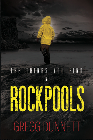
So next I returned to Rob Earp, who designed the cover of my first book The Wave at Hanging Rock. He also (after my initial efforts demonstrated I was no book-cover designer) did my second book as well. The reason I initially decided against using him for Rockpools is that Rob’s not a book cover designer either – he makes his living designing the look of the consoles for multi-million dollar super yachts. Rob’s initial designs were these:
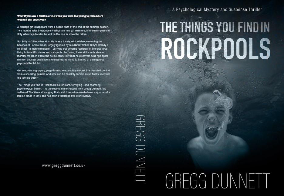
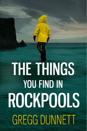
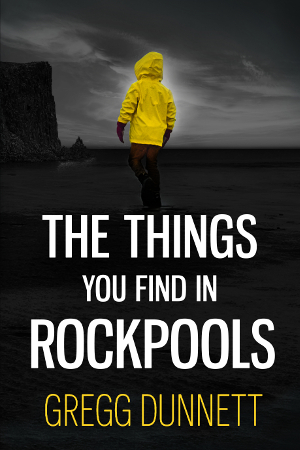
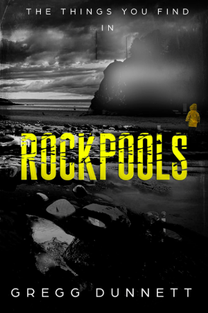
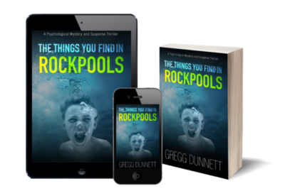
To be honest I think several of these could work, but I had a clear favourite, the image with the boy screaming out of the water. There’s a scene in the book which relates to this image very closely. But it wasn’t quite there yet. I think Rob has a particular talent for creating a look that is stylish and understated – which I’m sure works fantastically well in super yachts. For a book cover though it needed a couple of tweaks, nothing major – maybe just a bit of colour to help it stand out.
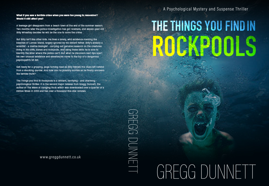
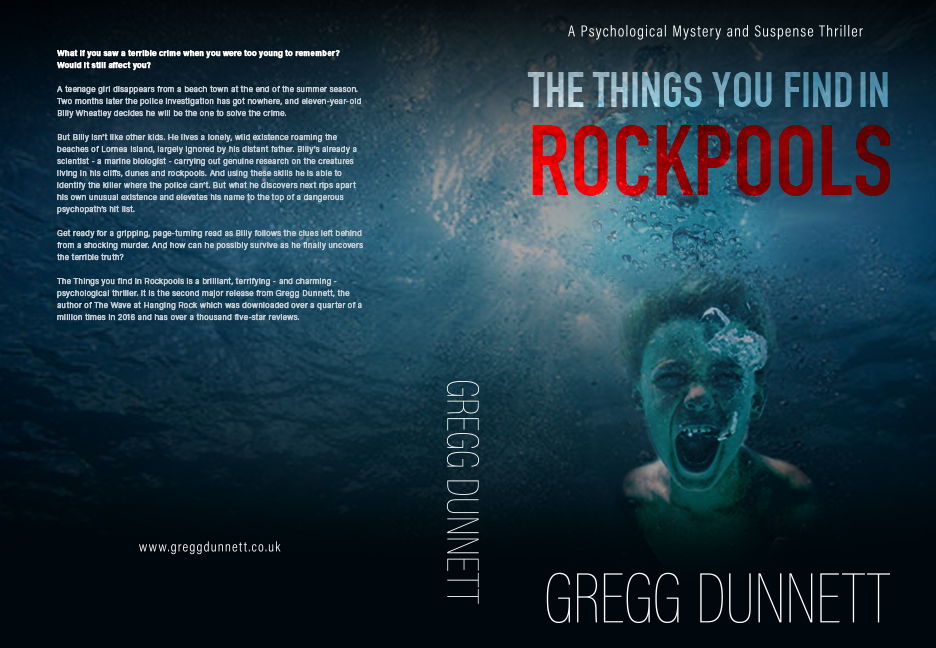
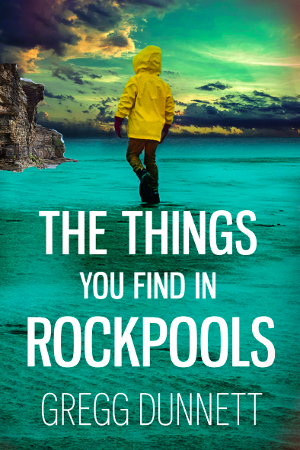
We settled on yellow since it stood out better. After that it was a simple matter of creating some fancy book graphics and job done!
Thanks Rob for a great, scary, thriller book cover!
Recent Comments