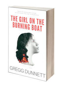
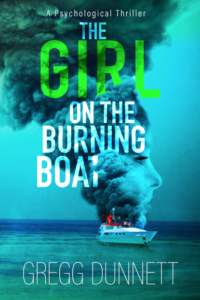
Below are two mock ups of possible covers for my next novel – The Girl on the Burning Boat. It’s important to note that neither of them is a final image – both would need a bit of work to smooth off the rough edges and refine, and I’m fortunate to have a very skilled designer to do that for me. But I’m torn over which is the better concept or direction to work on. Which is why I need your help. Do you have a favourite from these? And if so which one?
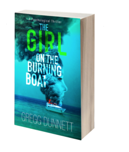
You can click on the images for a closer look. And I’ve tried to show the book as it might appear as a paperback, or on Amazon.
At the bottom of the this post is a poll where you can cast your vote. Thank you!
Cover A (White)
Cover B (Blue)
[yop_poll id=”1″]
Thanks! I’ll update soon with more details on what the book is about!



Blue is best – no contest!
Can’t wait to read it….
B for blue is the better of the two. More eye catching and the subtle face is a winner.
A is more eye-catching and the subtle face a winner.
Doh! Sorry Greg! I meant B for blue is more eye catching and the subtle face a winner.
Definitely the blue cover. If they were sitting side-by-side on a shelf I’d go for the more eye catching image and colour. The picture screams “read me”
It appears that I am in the minority,but I prefer the
white cover.
It holds moodiness and intrigue.
Love the blue cover, very eye catching. However, I would read anything with your name on the cover, so it really does not matter. Have fun choosing Gregg!
I really like the blue cover. It pops more than the white, and I would likely notice it first. However, I would read any book with your name on the cover, so it doesn’t really matter which one. Have fun choosing Gregg!
Definitely the blue cover – has much more impact and the face coming from the smoke is very clever. Like it a lot.
I’m very much in the minority, preferring the white cover. I like the idea, although the girls’ look is a bit odd – she needs to be looking straight ahead, not up as though she’s idolising whoever set the flames going. I do like the way the smoke is taken up into her hair. I didn’t even notice the girls’ face on the blue version until I read through the comments.
Think I’m in the minority too, preferring the white. It’s more stylised, aritistic and looks more mysterious. However, whichever you choose, I’m sure the story within the pages will be brilliant!
Oooops! Typo … I meant ‘artistic’
Hope you don’t regret asking so many fans!
It’s B for me. The initial impact is far superior and would make me pick it up for a closer look.
I’m in the minority, but I had no hesitation in preferring cover A. To my mind it has a more ‘classy’ and psychological look about it, hinting at the mystery within. The girl is looking towards the right, encouraging us to open the book. Cover B has the boat as the theme, whereas cover A gives the girl the priority, which no doubt reflects the premise of the book.
A. The white cover is more striking although I’m not keen on the woman’s image, it appears too computer generated. White is a less common colour for a book cover. Perhaps a little more fire which would give a larger pop of colour.
Defiantly the blue. I found the white a little creepy, where’s the blue was intriguing. I felt I wanted to read the book to find out what was going on. I like the fact that the title is slightly obscured by the smoke , it adds to the mystery. And I didn’t even see the face in the smoke at first! This covers speaks to be of many layers to be discovered.
However my 18 year old daughter said the white looked more professional, she could see it in a bookstore, whereas the blue looked more self published!!
Give the plot your usual pace, without f & b words, and readers will go for it without worrying about cover aesthetics!
Cover B is my preference. No doubt your designer will polish it right up. Will be a good read. Best wishes for the launch.
I voted for the blue but I would modify it slightly to add more of her hair to the left and blend it into the smoke. Get with one of your friends that claims to be a Photoshop expert and it should be easy.
I prefer A, but think it should have the background of cover B, then it would be perfect.
The girl’s face in the blue cover is far more subtle and the colour adds visual impact.
Prefer cover A, it appeals to me as it requires analysis by the viewer and is not so immediately “obvious” as cover B which for my taste comes across as a literal visual interpretaton of the title
The blue cover. White books always look daggy sooner! Don’t obscure the lettering.
The blue is striking and attention grabbing – while the white is neither of these things.
Like the blue .. maybe a bit more if the lady’s face but not as much as the white as that’s too much, but I think the smoke / hair concept is clever.
Definitely the blue sometimes if I don’t know the author the cover will attract me and this one would make me look closer at the story.
Blue…definitely…but make the name clear e.g….Boat not clear.
I definitely prefer the blue cover (B) as it stands out more and suggests ‘Thriller’to me. Whichever you decide on I know it will be a great book and I’ll certainly read it, whichever cover you choose.
I like the blue cover the best. Captivating and eye catching. White one is too plain and doesn’t do justice for your amazing talent,and how well you write. I know one’s not supposed to judge a book by it’s cover,but…
Maybe if the boat was larger on the white cover with more burning flame it would grab my attention more but I too have succumbed to vote B blue.
The white cover is too stark and doesn’t stand out very well. The blue is striking and would stand out from the shelf as well as a page on a computer screen. As you write with intrigue and suspense which the hidden face in the smoke seems to represent.
Both are possibles, with some changes. “A” needs a light background color instead of white – maybe a light beige. The boat should have a light color also, maybe a light (light!) blue & I agree with a previous commenter – the girl does look Neanderthal – maybe a different fact – also I think the head is too vivid – I think if it were lighter & hazier, like smoke coming off the boat, it would look more ephemeral & mysterious. I might like “B” better, with some changes. Get rid of the red on the boat – I assume that’s flames, but can’t really tell & it’s jarring. I think a little lighter background color might be better & definitely do the title in a different color – get rid of the green, for sure & make all the letters the same color – maybe the blue of the background but a little darker – would look nice against a paler blue/grey background – a different font might look better, too. I really like the design of the head on this one a lot, but I would change the color of the actual face – maybe a smoky grey would look good against a pale blue/grey background & just slightly more gauzy & ephemeral. Can’t wait to read this one!
As with so many of the other comments and observations,I have gone with option b.There needs a little tweaking to be done especially with the smoke obscuring the title. Can’t wait for the book though.May Gregg keep us guessing the outcome of his future works of genius.
I like the white as the main colour but prefer the boat design on the blue! There are a lot of blue coloured books about but white Would stand out more!! White cover, boat in a black relief design with smoke, orangered txt to suggest flames…I. Oils go n but I won’t bore you all! Just my humble ideas!! Sure it will be a fab book either way though. Good luck Gregg.
I voted blue, the white one looks like the girls hair is on fire
Lue cover, hands down, no question! I wouldn’t even give the white cover a second glance, plus the girl in the image looks neanderthal, suggesting a schoolbook on history or sociology.
I have chosen the blue cover because I think it’s a better commercial fit for the genre however the white option is stylish and would certainly attract my attention.
Much prefer with the blue cover as it’s more intriguing. The text, font and color give more of a contrast to the background that grasp your attention.
Definitely B for me! It draws you in and I want to pick it up and start reading immediately. Jules
Much prefer the blue cover, I think it has a more powerful impact. Love your books and am looking forward to reading this .
I prefer the blue cover as it has a more eye-catching look to it.
I like aspects from both covers: typeface and picture of A, but colours of B.
Absolutely love the blue option. The colours really grab me. What’s more I believe the fusion of smoke and the girl’s head makes a powerful statement. My only criticism would be I think the word ‘boat’ should be centred. It looks a bit obscure at the moment in my opinion. I could do with a designer like yours when finalising my book!
I like the blue one. I like how the smoke goes right into the title. It makes me want to grab the book, open it, and start reading. I can’t wait for it to be available.
I like the simplicity of the white cover. The blue cover is too busy for my taste.
Definitely the blue, more depth, more intriguing, as in why has the boat caught fire?
Positively delighted by the intriguing blue cover. The bright blue immediately caught my 74 year old eyes and has me aching with curiosity.
I prefer the blue cover. I did not initially see the girl until I started to read the comments. It is very cleverly done. I love your books!
Before even looking at other comments I had decided the blue cover was much more visually appealing. Good luck with finishing touches. Can’t wait
Much prefer B and it seems to be much more in keeping with the cover from “The things you find in rock pools” (another great read!)
Loving the blue option! The image is just right in my opinion. The white is good too but lacks the dramatic impact of the blue
I like the white because it is different and would stand out in a book shop. The blue looks like any other book on the shelf
Blue grabs the eyes and that’s what a cover is supposed to do. Definitely blue!! Can’t wait!
Blue cover is more striking – a picture paints a thousand words!
The Blue one stands out more. (Although, there is ‘something’ about the White one. Just not enough…) The flames on the boat (blue) could use a little work.
Looking forward to this latest book!
I really like the blue cover! The title being slightly obscured in just the right places is a great touch.
Blue cover is far more dramatic. See the point about the T being obscured a bit by the smoke but personally I don’t think its really an issue
The blue cover is better for a psychological thriller as it has leaves edge of the unknown lurking in your mind
Definitely the blue cover grabs my attention! The white is too boring.
I prefer the White cover. It shows more imagination and indicates intrigue, whereas the Blue one, although more colourful, doesn’t stand out for me.
Being the awkward mare I am, I’d love to go against the vast majority, but I can’t on this.
Definitely B, 100%
I do like the blue cover.
Definitely the blue – without hesitation.
Like the blue cover definitely! As already stated tho, the smoke obscures part of the title. Can’t wait to read it!!
I prefer the blue cover. I hope this book is as good as “Rockpools”
I picked cover A. I agree with the others that cover B would stand out better in a bookstore and probably sell more books (which I guess is the name of the game). However, cover A has spiritual or mystical look to it which I found interesting.
Both covers are good but to me the white cover suggests more mystery. However, being a fan of Gregg’s books, I just can’t wait to read it whichever cover it comes with!
The blue is much more interesting. You don’t notice the girl at first. ‘The Girl…’ for a title is becoming a bit passe but, there again, if the book is about a girl on a burning boat…
B is eye-catching, and certainly makes me want to read the book!
As already said, less smoke, clearer title and its a winner.
I’m in the minority at the moment; I simply find the white cover has more class. And, yes, it is a little creepy as someone else commented but that intrigued me rather.
Good luck, I look forward to reading it😊.
I think the blue cover is too busy so I’ve voted for the white. Still, the boat is better in the blue and the woman is better on the white one.
I think the second one reinforces your books (the last book also had a cover depicting the sea) I would see this and associate it with your books (which is good)
I also like both, but B is more eye-catching and pleasing. Looks like a more interesting book, from a marketing point of view.
Blue cover much more appealing
I’ve voted for B. A, if I was browsing in a shop, would suggest chick lit to me. Yes, I know, her neck is on fire, but that’s just how I roll.
B suggests a thriller.
The blue cover stands out more, which I like. However the white cover is more interesting. I don’t know if that helps!
Prefer blue – especially as I prefer to imagine my own characters ie. not having a preconceived image.
Definitely cover B, very striking and will stand out more in a book shop although I do like cover A as well just not quite as good.
The white one looks a bit boring, the blue books is good but you can not read the title properly bit too much smoke .
Good point about the smoke,Mary. More flames, less smoke.
No competition, the blue cover is the one. Digressing a bit, I think that there are too many titles with “The Girl” in them. Just saying…
Me too, but it’s apparently become so recognised as ‘a trope’ that is subconsciously reinforces the genre as a psychological thriller. Plus I spent ages trying to think of a better title, and failed! 🙂
Definitely the blue cover. It’s a clever image – I find the white one starks & a bit too creepy!
Blue one definitely invites me to read the book. The white one doesn’t stir any emotion in me at all.
I’d purchase any book with ” Gregg Dunnett”printed the cover!
The blue cover is much more visual and looks more exciting. It will stand out more on a bookcase so definitely the blue cover. Love your books btw!
No comment, I just like the blue visual better.
Hi Gregg, I really like the blue cover – the girl is much more subtle. In fact, I didn’t notice her at first and still thought that it was a compelling image. The girl on the white cover is seriously creepy looking and put me off! Hope this helps.
At first I didn’t notice her face in the smoke either and when I saw it, I liked the Blue cover even better.
Really like the blue – much more exiting to look at.
The white one just does not grab me. Cant wait for the book to come out!!
It’s very clever how the girls face is incorporated with the smoke. I think it’s a really good cover. Can’t wait to read the story.
How about the back of her head looking towards the burning boat. pitch black night sky flames flickering lighting up the night sky and reflecting off the sea
Just a quick note on the blue cover (which is my preference).The title is slightly obscured by the smoke (the ‘t’ in boat isn’t clear). Only an observation and something that’s probably already been picked up.
Both are good designs ..but I like the depth and colour of option b
I like the Blue one ‘B’ As the the book is a psychological thriller I think it holds more Drama and mystery. I think that the title could be a little less obscured by the smoke or you could use red letters for the Burning Boat words.
Agree with those who like the blue cover. Much more impact although the wording is a little obscured with too much smoke.
Agree with the blue and the impact. It was an immediate reaction to that cover.
Me too.
I do not like the white one at all. If buying a book would buy the blue one. The white is non plus. The blue one looks real. The white one looks like a manequin.
Both covers are great but the blue is much more striking and catches the eye.
I already know the book will be as fantastic as the last three
Yep b definitely the best option