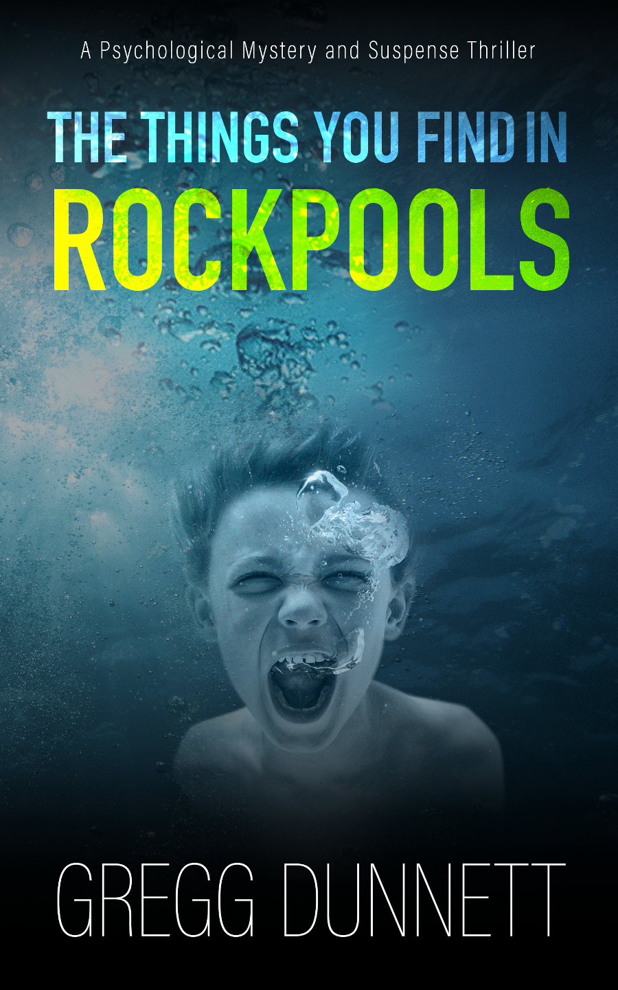
How do you make a book cover? Get a pretty picture, stick the title over the top. Job done, right?
That’s what I thought anyway, but (once again, in the exciting world of being a self published author) I was wrong. That one image has to do so much. It has to attract a reader’s attention when lined up among a hundred other book titles. It has to say in a glance what the genre of the book is (but without looking exactly like every other book in that genre). It has to somehow convey the tone and emotion that the book will hopefully deliver. Then the practical parts, it has to have room for the title, and the author name. It has to look good large and small. It has to look professional…
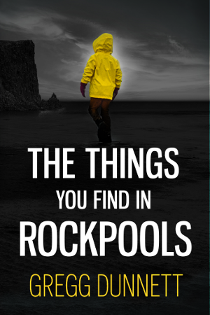
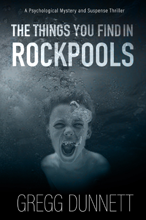
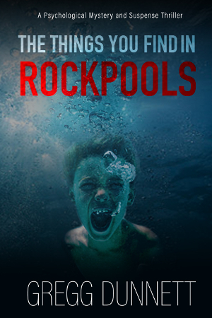
This post gives a snapshot of the many, many different versions considered in designing the book cover for The Things you find in Rockpools. The book is a psychological thriller about a boy who tries to locate a teenager who goes missing from a fictional beach town. The book is set out-of-season, when it’s cold and empty, and the boy has a fear of drowning – all themes that could be useful for the cover.
One of the early issues with the book was that title. In some ways it’s quite weak. It could easily be misinterpreted as a guide book to help children in identifying seaweed or crabs. So the cover had to shatter that misconception right away (and I had a hope that if it could do that, it would turn a weak title into a very strong one).
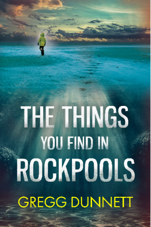
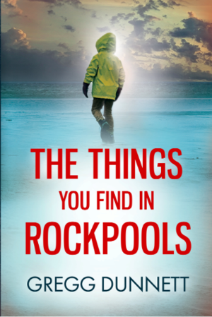
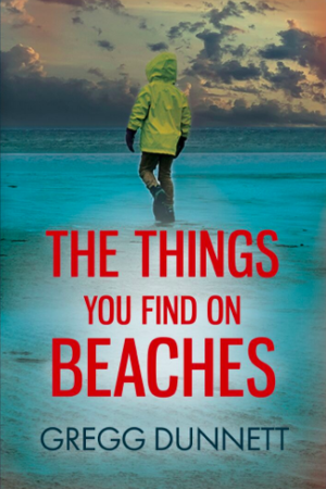
The images below are by no means every iteration of every version. These are just the ones that somehow got saved in the flurry of emails that went back and forth. There were plenty more, and I think everyone involved was close to screaming at one point or another.
The final cover design was done by Rob Earp of Cool Water Creative. I think it fulfilled the brief of looking distinctive, capturing the essence of the book and literally screaming for your attention! What do you think? And yes, please do use the comments below to tell me you prefer the other versions!
(You can click the images below to view them full size, and use the left/right arrows to scroll between them)

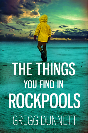
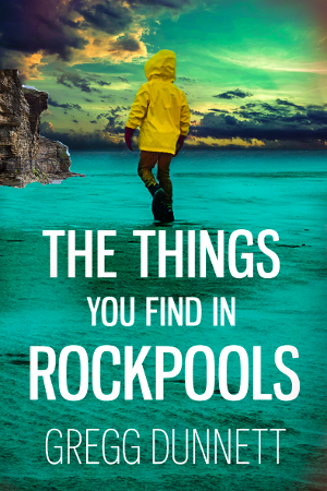
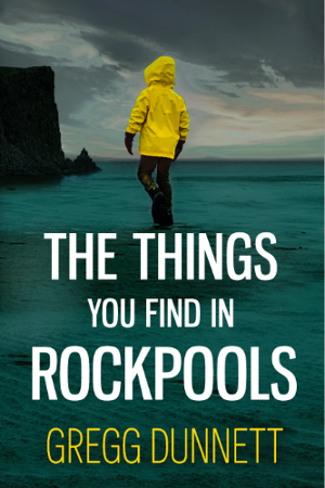
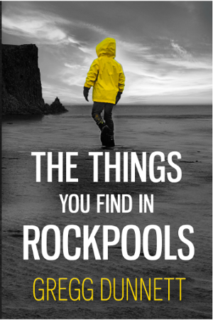
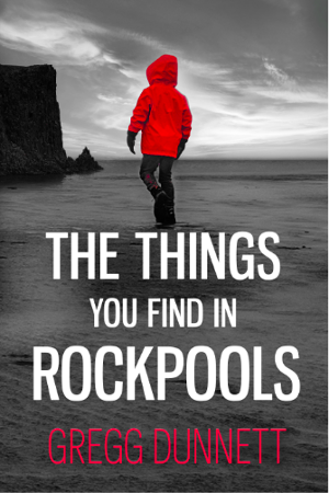
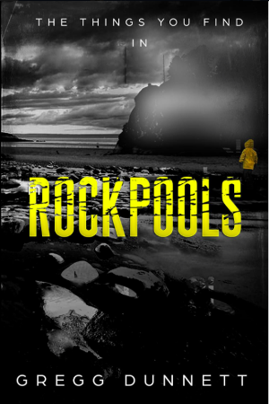
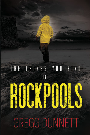
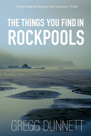
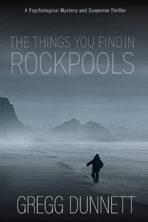

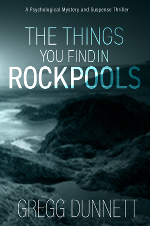
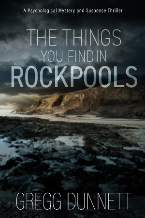
I’m a Graphic Designer so it hurts me to see so may iterations of the cover.. That poor Designer! ha ha.
Can’t wait to read it 🙂
I think your final choice is spot on, a lot of the others just seem typical of the genre. Your choice stands out and demands to be picked up for a closer look. I will definitely read it now. Well done 👍
Thanks Kelly, standing out was definitely part of the brief!
I’m American, so didn’t find your choice to terrifying or horrific. I feel that the cover you chose conveys what you have told us about the story. Good choice! Sadly, all my reading is on Kindle and the covers lose so much in the small b/w format.
Thank you Linda, and I agree, it’s funny how covers are so important when they’re not really attached to books anymore!
Much preferred your choice of book cover – although a bit scary. I’m not a lover of horror – which this cover initially suggested – but it’s quite clear this is a psychological / suspense thriller. I didn’t go for the image of a boy walking away – all it says to me is that there’s a lonely boy on a beach somewhere – where’s the suspense?
I’m glad you say that Ali (as lots of people have preferred the other ones). I was a bit worried it might cross over into horror. We lightened the boy’s face which helped a bit with that. I did like the boy on the beach though, there was something in his stance that made him look vulnerable (to me), which fitted in well with the story. Sometimes it’s hard to pick just one though…
Any book with the name GREG DUNNETT on the front would have been enough to attract my attention, having read your books. However I think your choice was a good one though obviously difficult, as the others were also very captivating.
Aww, thank you Freda, well hopefully there will be a few more books coming in the next few years! It’s very nice to know they’re being appreciated…
Hi Gregg, Reading your description, I think the chosen cover captures your brief nicely. The figure variants are perhaps too reminiscent of the movie, ‘Don’t Look Now’. Anyway, I’m sure it will make a big splash!
I hadn’t seen that before but I see what you mean. It’s also quite similar to the new Stephen King film ‘It’ (yellow anorak). I suppose there must be endless repetition of the image designers use to bring out feelings in people, just like how stories are endlessly retold in slightly different ways. Glad you approve of the choice anyway!
Nah! That is the only cover in the game. It is true to your
sense of humour. (and by chance-mine aswell)
Good luck with the closing stages because I for one have high expectation and look forward to it with fleet!
Thanks Maria – no pressure then!
Hi,
I think the one you have decided on is attention grabbing. It is full of emotion and action. It is dark. It is frightening. It is the best.
Your last email showed a family exploring a Rockpool and certainly gave off a totally different feel.
I wonder if your plot is as scarey as your cover?
PS. I have thoroughly enjoyed your first two novels.
Thanks Jane, I think it was the attention grabbing nature of it that I really liked. It literally does scream at you to look at it. Hopefully that’ll help it get noticed. (And the family was my lot, so I’m glad they didn’t come across too scary..!)
And now it’s number 11. Is it just me being spooked here?
I am a big fan of number 1. For me it totally epitomises my childhood memories of rock pools and has the boy in the yellow anorak standing out as the main character but doesn’t distract from the rock pools as the “scene of the crime”. Assuming of course that is the correct scene of the crime as suggested by the title of the book.
Not sure what’s happened but by the time I looked back at my comment, picture number one had moved to number 14!
And now it’s swapped back from 14 to1. 🤔
Hi Janie, I couldn’t work that out either but I’ve just seen the ‘gallery’ was set to ‘random order’. I’ve fixed it now but a bit after the horse has bolted I’m afraid. I won’t say too much about the scene of the crime, except that you don’t see it till the very end, and I’m just writing it now!
I like No 2. I want to follow the boy and find out what ‘things’ one finds in rock pools. It conveys a sense of enticement – you want an answer to the question – to find out more. The choice of mist and the color of the sky conveys a sense of mystery, eeriness and questions.
I don’t find your choice scary – I think he could have looked a bit more scared.
Hi Gillian, that’s exactly why I choose that title. Even before I’d written it, I wanted to find out what things you’d find in rockpools too!
Can’t wait to read this book. The cover you chose caught my attention immediately and added even more tension to your very intriguing introduction. Please let me know when it is available for purchase.◀
Very glad you’re looking forward to it Patricia! Thanks for your comment!
Hi Gregg, I have to admit, my favourite cover is No.9 followed by No.10. As I Live by the coast and mountains I feel No.9 has that mysterious look that at certain times of the year can seem quite threatening but at the same time exhilarating. Good Luck!!
I’ve said before in replies, but unfortunately I set up the gallery to randomise the image order, so I can’t see which was number 9 or 10. But thanks for your comment, and I know what you mean about how a landscape with coast and mountains can feel full of emotion. It’s so much more dramatic somehow…
I really like number 23 and number 12. There’s something about the desolate scene in 12 being devoid of human life that resonates and the writing for rock pools in 23 works really well with just the tiny figure of the boy in the distance.
I do wish I hadn’t messed up and set the gallery to randomise the image order… I’m guessing 23 is the very first image the designer came back with though (small image of boy).
It’s funny though how we’re all so attracted to desolate images (and I suppose stories as well). Something to do with living in a crowded world maybe?
Hi Greg,
7 or 9 would be my choice, i do find your choice a bit spookie and he’s not in a rock pool, he’s in the sea?
Can’t wait to read it whatever the cover!
😉
You’re right to guess he’s not in a rockpool but somewhere deeper!
I do find the final choice rather scary, but as I haven’t read the book yet, I can’t really comment too much.
I also really liked cover No. 18, but then, I did like Broadchurch and maybe it reminded me a bit of the first series.
Best of luck with the new book and I’m looking forward to reading it. (Have ready your previous 2 books).
Best wishes,
Angela
Yeah, I thought a bit of Broadchurch series one too (I live near where it’s filmed as well). For some reason that series really stuck with me, although I’ve heard the rest aren’t as good?
P.S. Meant to say sorry for not liking the final choice! I know it must have been difficult.
🙂
Hi Greg, Very much looking forward to the new book. My preferred cover would be number 9.
I wouldn’t pick up the book with the cover you have chosen as it would put me off. I prefer covers which are a little less obvious, hence number 9. I don’t think that number 9 would lead you to believe that it is a guide book. But, hey, what do I know! Good luck with it.
Hi Carole, sorry I realised later on that I had the gallery of images set to ‘random’ so I can’t see what your number nine was. But thanks for the taking the time to let me know. It’s interesting how you can never get a unanimous favourite with these things…
I like your choice for the book cover! my second favorite was #23