Below are three possible options for the cover for my next novel The Glass Tower (coming May 2019). I’d be super grateful if you could tell me which one most catches your eye (if any) and which would be most likely to get you interested in choosing to read the book. You can click on any of the images to enlarge them for a better look. I’ve very deliberately not said anything about what it’s about, as I want people to (literally) judge the book by its cover – since that’s how the cover will need to work out in the real world!
Please vote in the poll below, and if you have any comments please do leave them below.
All three covers were made by my long suffering designer friend Rob (coolwatercreative.co.uk), and they’re not 100% finished, but nearly there…
Many thanks!
Gregg
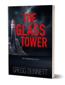
Option 1 (Red tower)
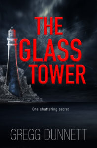
Option 2 (Blue Tower)
Option 3 (Clear tower)
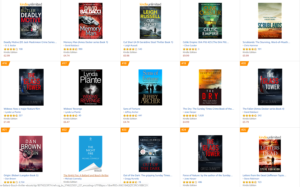
And here’s a view of all three options in a typical Amazon search page:
Poll
[yop_poll id=”3″]
Any comments, please do add them below.
🙂

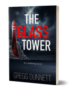
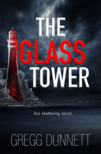
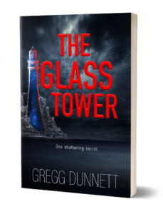
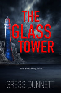
Option 2, the blue tower stands out just as it is. No white lettering necessary.
The coloured ones look far too happy. I’d associate them more with romance. The clear one does have the red reflection at the top and there’s blue at the bottom, so you still get your colours, but in a more ominous lighthouse.
Of course, you haven’t told us what the book is about. Maybe the cover ought to have a picture of someone towing a glass.
I think the blue tower stands out better with a good contrast to the red script. This makes it more eye catching in a page of covers. The blue glass adds mystery and atmosphere
I voted red, but mostly because of the white-red-white lettering of the title. If that was on the blue tower one, I would probably have gone with that one. Best of luck Gregg, I’ll be buying it whatever the cover is like! I almost exclusively read books on my Kindle, so the cover is less important nowadays although I suppose it does help choose a book in the first place. Far too many books on the Kindle store are billed as “the most explosive thriller of the year!” Well they can’t all be! Rockpools definitely fitted the bill though, loved every page and it was one of those rare books that left me sad it was over when I finished it! Hope the plans for a trilogy come to fruition.
Gregg, The Blue cover spells out loud mystery and suspense which is common theme to much of your writing. Thanks for the opportunity to take part.
Hi Greg look forward to this next best seller! Loved the clear tower, speaks to me more of mystery, suspense and the need to turn pages!! Although I do agree with the folks who have said the white lettering stands out more I feel the red lettering is lending more drama to the cover. As one reader who will read anything you care to write I wish you the best with this latest book.
Sorry,I don’t like the shape of the tower at all..is it meant to represent a phallic symbol? Lighthouse and pepper pot also spring to mind. A stronger round pillar shape or square tall box shape might better convey visual strength, but underlying fragility if that is what you are intending.
Clear for me, but using the white lettering from the red as it has more impact. Red for me always demonstrates passion and danger and blue is supposed to be a calming colour. The clear, black is more representative of sheer glass ready to shatter and the black obviously is representative of evil, mystery and something ‘dark’.
Hi Gregg,
I like the blue tower best but would like it more with the red and white writing….happy to beta read again if it helps!
Ros
Agree a cover catches the fresh eyes. I’d look for the author I like. The genre I enjoying reading. So on that note Blue cover as red same old. Black to medieval. All the best. Look forward to purchasing the book.
I like the clear or blue tower but I don’t think any of the covers ‘stand out’ on the Amazon page. Having white lettering makes more of a visual impact though. I’ll buy it anyway as I like your stuff (and your brother’s – reading that at the mo, thanks) but if I were just scanning the page it wouldn’t make me stop. Perhaps have the word Tower vertical on the page?
I prefer the clear tower and would go even a touch more monochrome on the image. The red lettering works but play around with a bold white.
I like the CLEAR tower best because it suggests ‘glass’, however I think it would be best if the word ‘glass’ in th name was in white rather the title in I think changing the ‘glass’ to white draws your eye more and stands out better…as mentioned a live however, I will buy it whatever you choose.
I think the blue tower with some white lettering, and your name a bit thicker, would be my favorite, but would buy it because you wrote it.
You can’t go wrong with any of them. I’m torn on a vote though. I like the clear tower best but the offset of the red/white words really makes them stand out on the other cover! Excited for the book to come out!
Having the title in White – red – White seemed to jump out at me particularly when it was in the typical Amazon line up. However, I’m sorry but the red tower was too phalanx-like (or was I the only one who thought that?!?)
Again on the Amazon line up- the blue tower appeared the best to me.
I like the blue, it draws the eye. It is not blatant like the red or bland like the clear, but almost makes you want to get closer even though there is still a mystery about it i.e. what does it mean, why is it there, is there someone there, do I want to know. I enjoy your writing. Looking forward to your next novel.
I very much agree with you
I like the blue best aesthetically; also I subconsciously associate blue with police lights, so that’s my pick. I don’t know if anyone else has suggested, but I think the tower would have more impact if the sides were completely straight rather than gently curving outward. It would eliminate that “salt cellar” problem, and the rigidity of the straight sides would add to the impression of severity and danger.
Hi Gregg,
I also preferred the red & white letters but the clear tower. Your name on it immediately brings psychological thriller to mind.
It will be a good read anyway as have enjoyed all the others.
It took me a while to tell the difference! Then once I noticed the different colours, I think the blue stands out the best!
I like the coloured towers, but the clear one looked more like glass than the others, it has a suggestion of fragility.
Blue tower, title in white, & also your name in a bolder white print.
Hi Gregg
I like the writing on the first cover with the contrast of white and red writing but like the blue tower better.
BLUE TOWER IS INTERESTING-NOT CLEAR WHAT IT MEANS TO PEOPLE BUT WOULD ATTRACT .
COVERS DO DRAW ME TO A BOOK BUT SHOULD BE A PART OF THE STORY NOT JUST A GOOD COVER.
JAYELL
The white/red text in option 1 catches my eye more than anything. However the red tower with it seems a little too much. I like the clear/black tower better.
I like the blue. I think it shows up yhe best.
To tell the truth,I like them all but the blue caught my eye 1st.The comments I’ve read were so in depth,describing
Red for danger!
Chose red tower because I far preferred the red and white text combo over all red. Also suits the red tower as the red text aligns with the tower and feels like the colour is reflected, thus connecting the text with the imagery. I think this combination would work with the blue as well but not with red text.
The ‘shattering secret’ text also needs to standout a bit more.
I really thought that the blue tower was the most eye catching. It also seemed fitting with the phrase “one shattering secret” because the blue looks like ice/glass, that would shatter. Everything about this cover has me intrigued.
Love the red. It looks like a vial of blood.
Blue for me Gregg! Cold, calculating and scary!!!
Red looks mystical!!
Clear looks a bit vague to me.
Looking forward to reading the book!!
Hi Gregg~ First, thanks for being such an accessible and immersive author, and for this opportunity to receive some feedback from your followers. As you know, your current fans and readers are going to buy ANYTHING you publish, so will select based on your name alone. That said, of the three you presented, I would have to choose #1 based on the alternating colors of the title. But since you asked, here are my opinions of the covers and why: 1) The overall darkness of the covers is a bit too dark (too much black color), so none of the towers really stand out. Perhaps a lighter area in the stormy sky (behind the top of the tower) might show it better (note several of the other covers you presented among the sample Amazon panels have a lighter area highlighting what appears to be an important part of their mystery). 2) If the stormy sky behind the tower were lightened, then not only the translucent tower might work better, but also it would appear–to me–to be more “real.” But if it’s between the blue and the red tower, I’d have to vote blue, since it stands out from the title colors. 3) The next two comments I’m basing solely on clarity: the tag line appears too small to clearly read, and your name–in white–should be much bolder. Whether I’m researching a new author to follow or just looking for other books in a series, prominently seeing the author’s name quickly gets me to their own page on Amazon (I’m one of those that prefers to read an author’s books in order of date published). While all your current fans know your next book is coming (and are excited!), I’m sure it’s the new reader that you want to grab. After all, isn’t that what you’ve (happily!) done to all of us?
The red and blue towers seem to distort the wording slightly when looking at the Amazon examples.
The clear tower makes more sense with the title but the red is definitely more eye catching. The blue tower didn’t do anything for me – just my opinion. Look forward to reading it whatever colour you choose.
Hi Greg, I love the blue tower. Not the clear one, that’s a bit wishy washy (in my opinin), but the blue is mysterious and I want to know what is happening there, what is going on.
I will buy your books regardless of cover, but it is important,so hope you choose the right one.
Best wishes with it.
Wasn’t easy to vote as I really like the red and white title but undecided as to whether I prefer the red tower or the clear tower.
I do know that I really don’t like the blue tower and all red title.
Can’t wait to read it and find out if there is a significance to the colour of the tower.
The red tower has more of a sinister feel too it – danger is implied. Blue is almost too calm and non-threatening. The clear/black doesn’t really evoke any emotion for me
when looking at the large covers on their own I thought the read one was better but having looked at the mock-up of the Amazon page then I think the blue is better. Whatever it is I’ll probably buy it as I always enjoy your books.
I really enjoy your books. The red one just stood out more to me as it picks up with the red writing.
Very atmospheric covers, but I prefer the red and the contrasting red and white writing, it catches my interest more than the others, giving it a bit of menace behind the story. Like the idea someone suggested of having the letters cracking like broken glass.
Very intrigued to hear what the book is about and look forward to reading it of course 😁
I find that the one with the white and red lettering stands out (pops) more than the others, hence why I chose it, but personally I much prefer the blue for the tower…,which I think you are hearing a lot of in previous comments. Oh, and I loved your April fool’s joke, totally had me hooked, and I was so disappointed to read I wasn’t likely to see a movie….mind you, when I got to George Clooney I realised what was happening!
The red tower stands out but I think the clear/black tower is the one – it looks the most mysterious. However, I think the title should be white & red of the red tower pick – it stands out more than anything else and would attract me to the book
I voted for option 1 as I do think it stands out however I have to say I don’t think it looks much like a tower more like a salt:pepper pot
I like the clear tower. I read the comments before mine, and now am concerned that your job will be more difficult from seeking our input. We are nowhere near agreement except that we all want to read your next book. Good luck! I will likely purchase it regardless!
Hi, Gregg, thank you for including me again. I don’t like either color so I voted for clear but I think the white lettering, with the red tower cover, is more attention grabbing. I think the red lettering is too bland. What if the words “The” and “Tower” were red and “Glass” was white? The white lettering grabs my attention and compliments the clear tower,
Voted for the blue, however, I have read any/every book you’ve written so far. I prefer becoming absorbed in the story from the beginning and letting the events unfold. I’m a huge fan of your writing style and enjoy the e-mails you send out. The e-mails always make me laugh.
The red cover is the most visible one of the lot, that’s why I voted for it.
I chose the red tower mostly because the title was in both red and white which made that cover stand out much more on the sample Amazon page. Just looks more dramatic.
Still reading The Girl in the Burning Boat
The clear holds depth and dimension bound by the vivid red title
I will buy it regardless. I love all your books and I always pre order them when I can. It’s great that we fans get a heads up on new releases and can contribute ideas at times too. Keep up the good work.
I like both the blue and clear towers, not keen on the red one.
Well honestly, glass is clear………….. but I am probably being too literal…….. I think I might be anal……… now I am questioning my ability to judge what colour glass should be….. damn………LOL……. Honestly why not just splurge all colours on a page and we’ll read it anyway!
Maybe I am just ornery. The image is more like a tall salt shaker or perhaps a light house. For sure it is nowhere near my perception of a tower. But perhaps if I read the book it would make more sense? Whatever image you finally choose if the aim is to make it a stand out eye catching image perhaps it needs to be a fresnel 3D . I must admit I have no idea what the cost of such an image would be, maybe prohibitively expensive. But until lots of others adopt the same strategy, it would definitely stand out from the competition.
I prefer the clear glass tower because glass is usually clear and it gives that mystery feel to the book. However, I think the title should be the color of option 1 with ‘The & Tower’ in white and ‘glass’ in red. Although, the tower looks little bit like a bishop piece from a chess game.
Heya Greg!
I like the “clear” tower, although as others have said it looks more black than clear. What I liked about the cover wasn’t so much the color of the tower as it was the red typeface for the entire title contrasting with the rest of the background. The red & white combo didn’t work for me as it was too busy, too many color things going on in a simple background, especially with the white “cloud nebulae” directly behind it.
Another issue for me with the “cloud nebulae” behind the title: the title is nicely left justified along the image of the tower and rocks. the “cloud” seems out of place being too centered. I’d prefer encroaching on the “negative space” in the upper right corner and have the cloud “begin” there and swirl around slightly in a counter clockwise fashion, spreading into the background beneath the title text. Keep the “nebulae” feeling, but give it a bit of a dynamic swirl – think wind pattern of a tropical depression before it becomes a hurricane.
If your not up for the dynamic swirl effect, move it off center into the upper right quadrant to balance the tower dominating the lower left. The title in the center is enough going on in that space. That will draw the eye either from lower left to upper right or vice versa.
I’m looking forward to giving this book a read (like all your work!)
Best regards,
Mark
For me, it’s “title first” and colour contrast conquers ! The red and white jumps outs at the reader. The colour of the tower was insignificant to me :). Can’t wait to read this one .
I went with option 2 as I love the blue tower, but it will “pop” more with white writing I reckon. Either way, it catches my eye, and I would read, mainly because I love your books anyway…
Love the blue gives it a feel of suspense and mystery that make you want to read and reveal. Like all your books whichever you decide will be fine with me and I cannot wait to read it.
I was immediately drawn to the red tower so I won’t overthink it and will vote with my instinct. I really enjoyed Rockpools but Killing Kind genius! More please….
I love the cover. The red lighthouse makes a more balanced picture with the red lettering. It’s striking and dramatic. But just your name draws me to the book. So I’m glad your name is huge.
The white lettering stands out in the ‘Amazon’ mock-up; red suggests blood/anger/passion so this combo gets my vote. The tower looks a little like a pepper pot though! Best of luck with this and the other ventures!
I do prefer the blue tower but also prefer the title in red and white. Definitely look for your name before looking at covers.
I have to say that I didn’t really care for the cover in general. Given the 3 color choices for the tower, I originally chose the clear. Less is more scenario. However, when viewing in the Amazon look alike, I thought the red tower “Popped”. In a pure aesthetic appeal, no interpretation of what that color stands for. Good luck!
I agree with all those that feel the red is angry/passion, the blue is cool/suspicion and the clear looks black and mysterious. Must have the red print…I love that it pulls your eye to the title.
I think it’s option one more because part of the text is white and stood out more
Although I chose the red tower in the poll, this choice was purely based on the white and red lettering of the title, which stands out more than the red on black, especially in a row of books. It attracted my eye much more than the others. Nevertheless, I’d prefer the white tower with the red reflection from the ‘glass’ part of the title. The red tower DOES look somewhat phallic, as one person commented already. Also, it tends to disappear into the black background, whereas the white is a crisp, visual emphasis of the title. Contrary to some opinions suggesting a bolder representation of your name, I rather like the understated script, as it does not distract from the overall visual advert of your story. Opinions, opinions! You may have opened a can of worms, having to sift through all of them… Goid luck, Gregg!
I’m into the red tower with TOWER written in red. It caught my eye from the get-go. It’s for sure something that would intrigue me. Can’t wait to read it, Gregg!!
I don’t think the cover says anything at all. Is not interesting. The blue tower is my favorite of three things to pick from.
I love your books. I will buy it for that reason, but I The cover is not interesting ( like the kid underwater from The things you find in Rockpools). My own opinion. That’s why there is vanilla and chocolate and strawberry.
I liked the title in the red and white letters, but think it would look better with the clear tower. Looking forward to reading your next book! Loved both Rock Pool and Killing Kind and even before your April Fools email (which had me going!) I thought both would be great movies!
I prefer the blue tower but think that the title should possibly also be in white and blue, not red. I couldn’t see that the third option was clear, it looks black. Love the books any which way.
Definitely prefer the white and red title.The red tower leans a little more to the horror genre.Either the blue tower or the clear tower links with the idea of a glass tower.
I prefer the clear option. The red option to me looks like a bottle of vinegar and the blue filled with some kind of chemical.
I prefer the clear tower because it seems as though the flash in the sky behind is lighting it which intrigues me. The blue just doesnt make sense to me. The red makes me think of anger and it looms like the title is lighting it. I love your books! Keep up the GREAT work!
Hi Gregg. First of all, I loved the April Fool’s email. Being a West LA child, I totally believed you, right up to George Clooney. Stuff like that happens all the time! I enjoyed a good laugh and had a story to share with my husband when he got up. About the covers, the blue just doesn’t work for me – it dims the interest in the cover. The clear has a kind of noir appeal, but overall the red with the crisp contrasting red and white lettering attracts attention and interest more than either of the others.
My choice of the blue tower is strictly personal choice. I collect cobalt blue glass, so needless to say, the blue tower caught my eye. Best of luck whatever color is chosen.
Red for me! The cover is dramatic and the word Glass in red draws my eye to the tower. Don’t like the blue, very cold looking, and the clear one doesn’t stand out enough. I’m also not keen on the all red lettering…too much! I’m sure whatever you decide will be very successful and an looking forward to reading it. Oh, and I was totally taken in by the April Fools! 👍🤦😄
I chose the red tower because I found ‘The’ and ‘Tower’ in white with ‘Glass’ in red much more eye-catching.
I like the last clear tower but like the red and white wording too.
Looking forward to reading it ….
I’m probably in the minority, but the red tower has my vote. Anything that stands out amongst other book covers must be a huge plus, especially eye-catching if you don’t know the author’s work.
I, however, do and will buy the book anyway …..
I really liked the clear tower but the white and red letters with the red tower really stand out when you look at the amazon search picture. The all red letters with the blue and clear tower disappear into the black background.
The red with white writing stands out to me.I don’t particularly like the blue tower, although it wouldn’t put me off buying the book, especially if it suited the story.I too liked The Rockpool and The Wave at Hanging Rock. I still have another two of your books to read, and am looking forward to doing so.
Hi Greg, Just to be awkward I would like a mix of the red tower and the clear tower. I think the title is better is the white and red lettering and I prefer the clear tower, which is a bit of a surprise to me as my favourite colour is blue and had I not seen the mock up I would have gone for that.
I also thought the white and red lettering stood out more among the mixture of books in the amazon example.
Look forward to reading it.
Option 1-Red.
“Glass” is definitely what you see first,which leads your eye to the matching tower. The contrast of having “Glass” in red against white immediately caught my eye.
If I saw a print version in a store,I would surely flip it over and read the “blurb” on back.
I prefer the clear tower but would make it lighter, more like ice so it stands out better with a sense of fragility. I also agree that your name needs to be in bolder font as it gets lost in the background, after all it is your name that sells books to me! Good luck with your final decision.
Hello. I liked both red and clear towers. I think the red white red wording is best. I will buy your book because i have enjoyed everything i have read so far. As for the cover it would catch my eye and i would read the intro.
Sure hope “Things you find in rock pools” will make it as a movie or TV series!!! Would love to see it coming alive!!!
I’m with the blue team….red just makes me think of conspiracies and political scheming, and that’s a big turn off, for me. The clear could work, but definitely speaks of fragility. Depends what the characters and story are based on, but you’ve not let me down, yet 😊 Excited!!
Hi Gregg
I really like the clear tower – it seems the most mysterious, also ties in with the books name….glass/clear… The red is too much, and the blue seems too unnatural. Whatever option you choose, I am sure I will love the book. Can”t wait for the release 🙂
I picked clear because it makes me think more of glass … shattering … scary !
I think having the word “glass” in red pops out more and draws my eye to the cover rather than the complete title in the same color. It makes me think suspense of something breaking or mystery. As for the tower you could just switch it to blue to keep it from blending in so much. That’s just my artist opinion.
I loved “The things you find in rock pools” so much that it was our book this month for book club!
The blue is the most eye-catching in my opinion. I like them all a lot though! Looking forward to reading the book.
The tower itself needs to project into the actual Title.
I like the red and white wording of the red tower best, but the tower I like best is the blue one. On balance I’d go with red, blue, clear as my order of preference.
Looking forward to it coming out whatever the cover is!
The clear appeals most to me but you know it’s what between the covers that matters. And you know I’ll buy it because Greg Dinner wrote it!
Dinner? Lol
Gregg, I like the one with the blue tower but I think it’s because all the text is red. It suggests opposite emotions and the setting of the Lighthouse spills light on the turmoil of the psyche as represented by the sea.
I’d certainly pick it up to read the back sleeve.
Interested to find out what genre/s it turns out to be.
Best wishes,
Gill
I first liked the blue best but then realized it reminded me of a bottle of perfume! So I’d go for the clear
I like the overall design and the color choice of white red white for the title in option one is the most eye-catching, but I don’t care for the red tower alongside it. The blue tower does look a bit like a fancy bottle filled with blue liquid so not overly fond of that one. I like the idea of the clear tower (The Glass Tower), but it seems just a little plain- maybe just some sort of highlight or maybe a suggestion of something inside?…
Anyway, the design itself is good with the lettering colors in option #1- if it were a book by an unfamiliar author and had the clear tower I would probably take a look at it, but with a tweak to that tower I think it would definitely catch my eye and have me take a closer look!
For me, the red has it.
This is based purely on the fact that the white THE and TOWER stand out more to this sight impaired person.
As an ebook cover I felt it wasn’t the most predominant, the other two took even longer, with zoom to find. And as others have stated, your name does not shout out from the covers either. Maybe as an analogue book, with the cover embossed, they may have more impact.
Finally, could you hold back publishing for a couple of months as, knowing one was in the pipeline, was planning on it being at least part of my holiday reads. Damn, will just have to make sure I’m caught in somewhere else before the release date. Delay that first thumb flip. 🙂
I love the red cover!! It’s perfect! However, I think if you switched red for blue you’d have the winner!!
I chose red. Red may depict anger but it also depicts mystery and loneliness. Blue felt too cold. And the clear needed to be more solid….like ice. Red is the best choice in my opinion.
I like the clear tower with the white and red title font 🙂 — a mix of two options.
It may be just me but I think the Red tower is somewhat phallic !! Be careful how you present that.
I go for the blue Tower, it reaches out with mystery and suspense. Your name alone will do it for me.
Well Done!!
I voted for blue tower. There seemed too much red with red lettering too and the clear one, I actually thought was black.
So, about even on the votes so far then ? lol
Love the blue, I think it stands out more. Really looking forward to this book.
Hi Greg, the cover design is great, the red stands out, probably enhanced by the red text, but it also says to me strength, so if you’re going for fragility, the clear says that more! The blue is lovely, but says fantasy to me.. but hey! you know what you’re writing!
I’m sure I’ll love it regardless! 😊
After voting, I see the red tower is the most popular, but I like the clear tower. The red tower reminded me of a catsup bottle, so unless an heiress to a catsup fortune is brutally murdered, it seems out of place. The blue tower is my second choice, far more forboding than the red. The opaqueness of the clear tower lends itself to individual interpretation.
Can’t wait for the book, congratulations. One day, I’m hoping you’ll write a sequel to Rockpools. Great character development.
Hi Gregg, I chose the red, because it looks good with the red lettering and it also stands out more amongst a bunch of other books. I am immediately drawn to it because it looks like it will be something that will captivate your attention and keep you enthralled!
Keep up the good work!
Cheers all the way from South Africa
Ilse
I like the first one especially not having the whole title in red. I really like the red tower because ot stands out.
Your name “Greg Dunnet” is lost against the title colour. You need a bolder type face or stonger colour. Same reason for choosing a blue tower as contrast to the main title.
Good luck with the Rockpool film.
I think the red is too similar to the lettering. The blue deems to denote something chilling. I’m with Jules above, I will buy your book regardless of the cover.
Don’t really like the red title. Might be better if it were blue and the tower blue.
I think the tower should be more central and prominent.
The clear tower speaks to me of fragility, making the by-line ‘one shattering secret’ more intriguing and mysterious. Looking forward to reading it.
I love the blue tower,but it should be slightly bigger,not so keen on the red writing, gives a sense of bloody thirsty rather than suspense, it should ripple into the water.
I chose the blue tower Gregg, but I know you’re looking for honest opinions here and, honestly, I’m not in love with the cover design at all. It doesn’t grab me. But I’ll still read it and love the book I’m sure! Good luck….can’t wait!
After lengthy debate the indicative vote in this house is for the Blue Cover. We think for immediate visual attraction it contrasts nicely with the red title. The red tower is overshadowed by the red title and the clear tower is indistinct. So we’ve opted for the middle ground. Good luck with this latest edition to my ever-growing Dunnett library,looking forward do reading it.
Paul
The best tower colour is the blue one but the title reads best in white, red, white.
The blue tower suggests fragility while the red word ‘GLASS’ suggests menace and is more eye catching.
The red one just pops out to me, and also gives almost an ominous feeling. I’d want to pick it up and see what it’s about! I also like how the word ‘glass’ is written in red while the rest of the title is in white – that draws my eye, too! I’m excited to read your new book!
Sorry, but it’s your name that is the hook now but I would def go for the clear one. I think that the blue looks like a perfume bottle!
Gregg you know I will buy your book regardless of the cover but I ADORE the blue. The red to me speaks of Anger, the clear of invisibility. The blue speaks to me of mystery and something to be explored and discovered. Thank you for letting us all be a part of your process.
The clear tower appears to be black; indicative of the turmoil that goes on in the tortured mind of an individual torn between good and evil. The darkness of a twisted personality seems more personified in the darkness of the tower!
Loved the Rockpool!
Agreed! It is more a black tower. And a nice one.
The red tower denotes anger, passion and thus crazy stuff about to begin. Can’t wait.
Whatever, I will buy..
Connie Martin Carter
Blue tower. Agree with Cynthia J. About the white and blue lettering with cracked glass effect.
The red looks slightly phallic…..the blue stands out and is the most eye catching as the blue jumps out of the cover
The first with white lettering stands out to me and would make interested enough to go on to read the preview.i think it looks very smart.
I agree. The white lettering stands out on a dark cover and is therefore eye catching.
The shape of the tower bothers me. It looks like a chess piece or a little like a lighthouse. Perhaps that’s relevant. It just doesn’t call to mind a tower to me.
Love the covers, the clear one ooks like a salt shaker though. Blue or red, your books rock!
I chose the white lettering as I think it stands out and catches the eye. But I’d prefer it with the blue tower. Also, the suggestion of a slightly shattered ‘Glass’ is a good one! Can’t wait to read it!
I like the blue tower. But I also think the title stands out more with the words “The” and “Tower” in white. Perhaps you might print “GLASS” in a bright, translucent blue to match the blue tower. And maybe the letters could appear to be cracking, to emphasize the “shattering secret.”??
Cynthia J. I agree completely ! Jules E. I agree with you also.
I am a real fan of your work and I will likely buy it as I have loved all of your books.
I agree with Jules. The blue speaks more to me of mystery and things hidden; red to me implies passion whether it is anger, romantic, etc. Some are suggesting the white lettering. I like the red; to me it suggests the passion along with the mystery. Also, the blue tower stands out more against the dark background than either the red or the translucent. Everyone has different tiggers, so what works for me may not work for someone else. The cover draws me, but the excerpt, first page, and the author’s name are always deciding factors for me.
I agree with Peg…the eerie blue contrasts with the red and makes me think of the Dunnet style of writing.
Yes, and BLOOD!
Hi Gregg
Like others as a great fan of your work I will read The Glass Tower whatever cover you decide. In the interests of helping your decision my preference is to have the title of the book red/white as it stands out more with a red tower as in Option 1.
By the way Rock Pools would make really good film so good luck with that.
Gordon
Gordon, I agree with you entirely!
Like the clear one, strongly dislike the two colored ones. But in all honesty, while it’s a nice enough cover, it seems kind of generic and not attention-grabbing in the least.
Agree with you very generic and not attention grabbing to make me i interested in reading the book
I prefer the clear tower which to me means transparency. But you really never know what is real and what isn’t, like an illusion. Things are not what they seem. Although you can see inside the tower, you might not be seeing what you think you are seeing.
Definitely, the red and white title with the word GLASS slightly “shattered”. The Blue is artificial looking, and the Clear lackluster. But any way you choose, your name is what grabs me now. Can’t wait to read it!
I actually liked the clear tower better, but when amongst the other books the white writing stood at more.
Just loved the cover straight off, caught my eye. Would make me stop to see what it was about.
Think there is only one option.
The red one too ameturish
The other one I didn’t notice but the clear one gels with title…creating interest.
Double impact visual and imagination.
Like the overall impact but it does look a bit like a salt cellar 😅
Blue tower.. but with white and blue writing!
Totally agree any cover will do if you know the author
The clear tower does appear black and therefore becomes enigmatic and sinister. The blue and red colours seem unnatural and gaudy unless either colour is indicative in the plot. Send me a copy Greg so I can form an opinion!
Love all your books regardless of the cover but think the blue tower with red writing is more striking .